IN THE TEXT OF WOMEN WRITERS
date Fall 2017
course Special Topics on Visualization in Network Science | Northeastern University
professor Cody Dunne
THE PROJECT
Co-created with fellow classmate Zhengyan Yu, this project is a product of the computer science course in network visualization. We partnered with the Women Writers Project, a long-term research project focused on the electronic text encoding of early modern women's writing. The research group had an interest of visualizing their text collection in a new way that could engage both students and researchers, enabling them to learn new information about the text collection in a visual, exploratory way. An interesting aspect of this electronic text collection is that elements, or variables, are encoded within the texts. Therefore, we highlighted the collection through three in-text elements: person names, organization names, and place names.
The visualization is broken down into three parts:
- A beeswarm plot showing each text in the collection by genre and publication year.
- The bipartite network connecting the top 20 in-text element names to the genres they exist in. One connection exists per text that the name appears in.
- A list of the texts in the collection that have at least one of the top 20 in-text element names. This list corresponds to the filled-in circles in the beeswarm plot.
To see the blog post about this visualization by the Women Writers Project Blog, click here. To interact with this visualization, click here.
THE DESIGN PROCESS
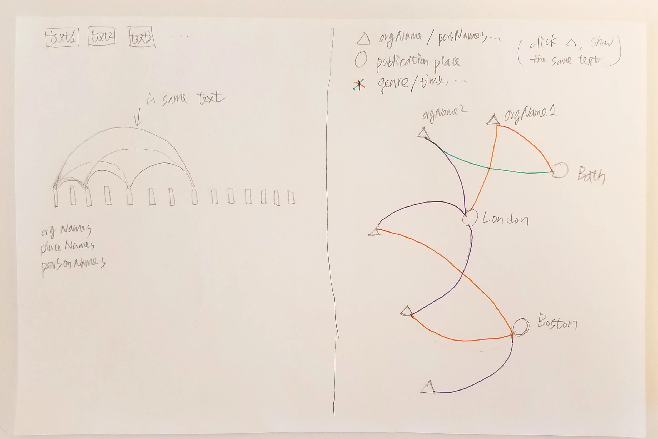
The images below show our initial sketches for the project. Most of them involve a network form in some way. Some of the sketches show how we wanted to represent the collection from multiple viewpoints early on.
Once we began programming, the metadata view of the collection and the bipartite network of in-text elements both went through several iterations. This was partly from populating the design with data and pushing our programming skills. The image below shows three iterations of the metadata view, each which plot the collection by date and genre. To resolve the overlapping circles in the first iteration, we tried concentric circles for texts that were published the same year. With the allotted space for this view, however, the concentric circles did not fix the overlap. Therefore, we went with a beeswarm plot, which uses a force-directed layout to prevent overlap. This layout also allows for more direct interaction with each individual circle.
The second image below shows a few iterations of the bipartite network. The first iteration connects the top names to each text title. Since there's about 400 texts in the collection, the right column was quite lengthy. The second iteration connects the top names to the genre of texts, while maintaining links for each text. However, several links directly overlap one another. Therefore, the final iteration evenly distributed the links on the left-side of the network, giving visibility to each individual link. We added lines to show the spread of links which also act as a thin, stacked bar chart.


