EF ON-TOUR EVALUATION
date Summer 2017
position Design Intern | EF Education First
During my summer with EF Education First as a design intern, I was tasked with redesigning the user interface of the on-tour evaluations. These are tablet-based surveys that teachers fill out during their EF tour to evaluate their tour experience. I worked with Sketch to redesign the evaluation, using one of EF's Spain tours for content.
The evaluation’s homepage has a welcome message for the teacher and a card for each survey: one for each city in the tour and one for the tour overall. Each card has a unique design and a status icon.
Each city’s survey has three parts:
- rating for the overall experience
- ratings for each component
- free response
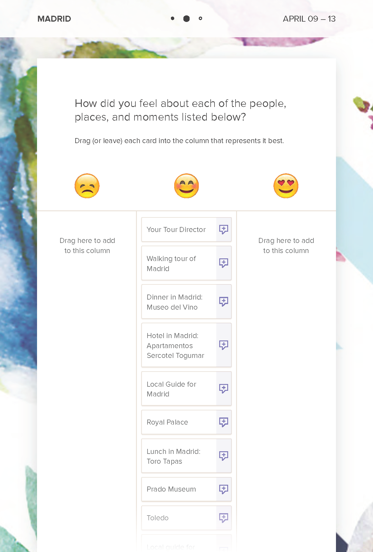
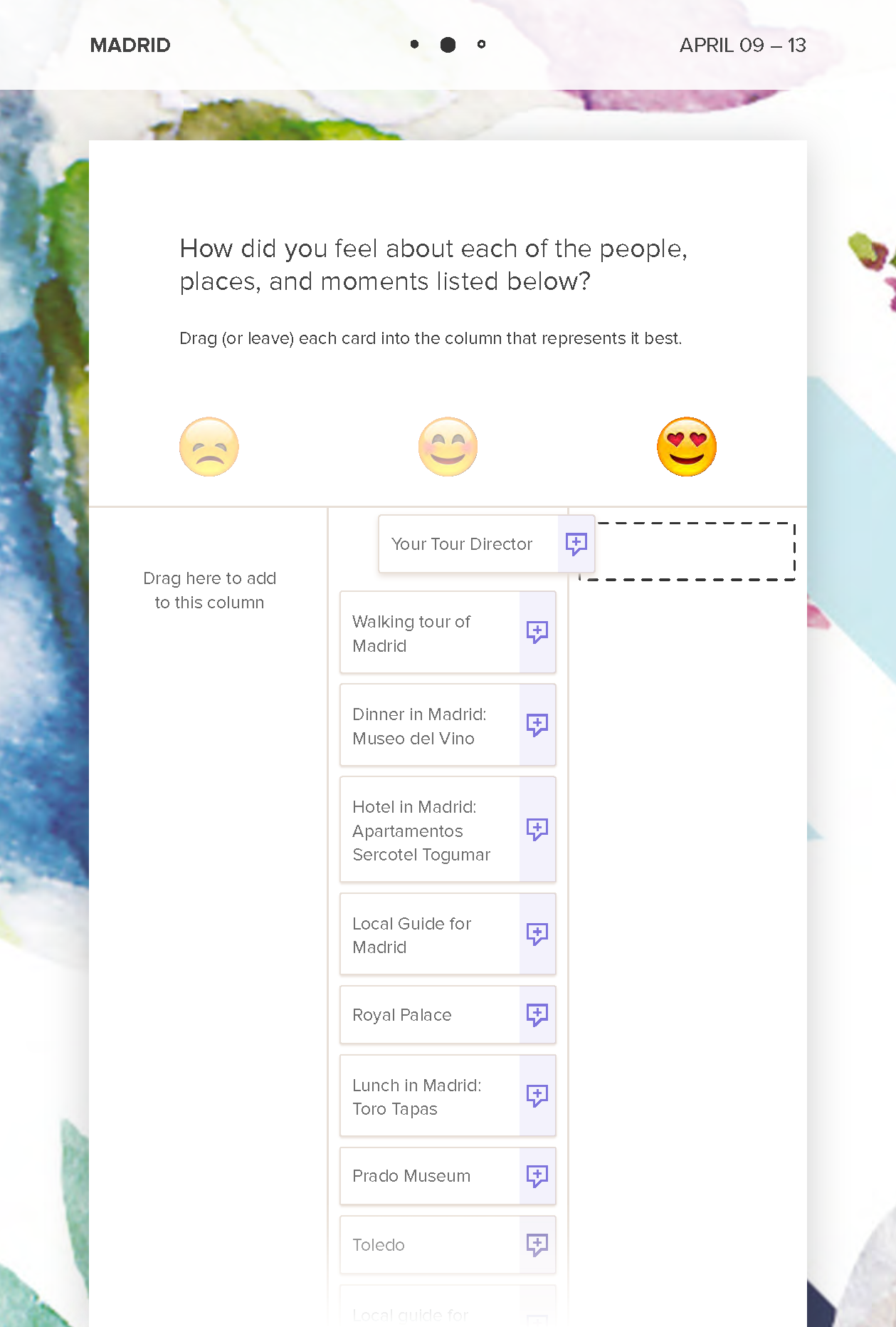
The second part, which involves rating each component, presented the most difficult design challenges because of the potentially large number of components and the layers of functionality. Many of the design decisions that thread through each part of the evaluation was dependent on this components screen. The different stages of this screen are laid out below. Each component is listed at a default rating of 'happy'. This is due to the typically positive responses that teachers have historically given. The components can be moved to the 'unhappy' or 'loved it' columns, represented by emojis. By clicking on the right side of a component, a teacher can add a comment to better explain their rating and experience.
When the tour is at its end, the teacher can then fill out the survey for their overall experience, which has five parts:
- their recommendation score
- rating for overall experience
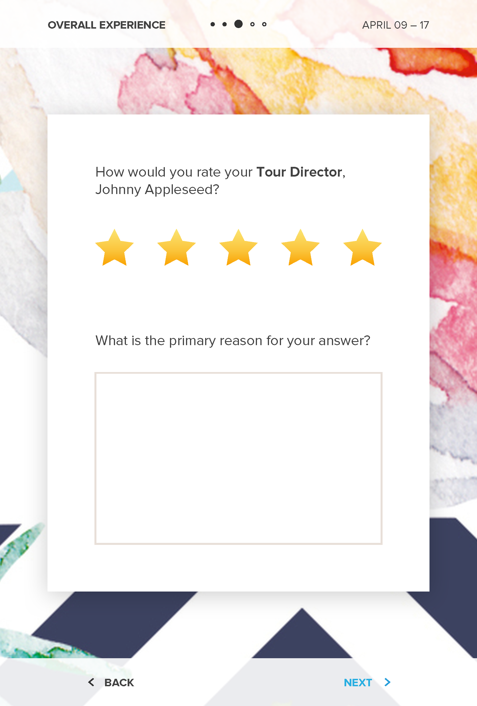
- rating for the tour director
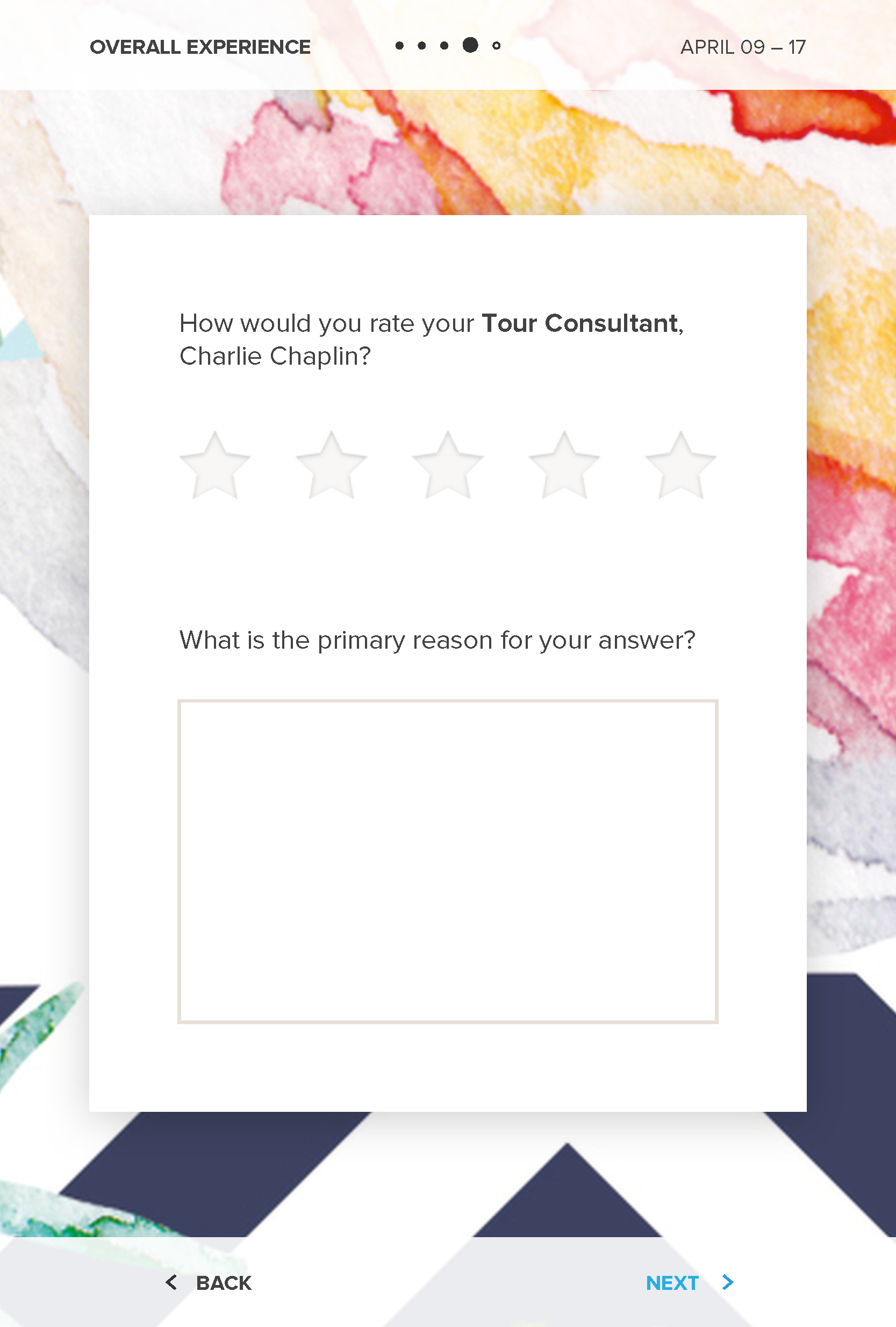
- rating for the tour consultant
- free response
Once completed, the teacher reaches a ‘thank you’ page before being directed back to the homepage. I added some fun imagery on this page to make it more inviting.
Consistent through the screen designs is a header with a title, an indication of progress, and the date range the survey pertains to. At the bottom of each screen are navigation buttons, which are subtle but colored consistently with EF’s treatment of links on other digital platforms. The survey contents for each part sit within their own card, which is sized to match the content and is vertically centered on the screen, with exception to the component screen. I gave each survey within the greater evaluation some individuality through its background design. The background designs were a mix of organic watercolor marks and geometric patterns, mirroring the collage theme EF has in other designs. The intent was to create a fun and warm background that didn’t distract from the task at hand.


